Lessons > 7. Principles of Visual Design
Today we will be discussing a few different visual design and usability principles:
- Selecting colors
- Communicating values through visual design
- Examples of style guides
Slides
Lecture Video(s)
- Recorded Lecture Video (52:02)
Do the Activity: Communicating values using visual design
Scenario: You are building your own personal website / online portfolio and want to visually communicate your own unique values and brand identity. Please complete the following three tasks:
1. Values activity
Using this list of values, select 5 that best describe the values that you want to communicate about yourself. Then narrow those down to 3 values (you don’t want too many or you will dilute your main message).
2. Search for inspiration
The best way to learn how to design is to look at great designs! Go out to the internet and bookmark 5-10 web pages, images, advertisements, banners, etc. that you think look great! Why do they look great? What choices have they made in terms of:
- Alignment
- Contrast
- Proximity
- Color
- Typography
- Textures
- Images
Take a look at the Design Resources page.
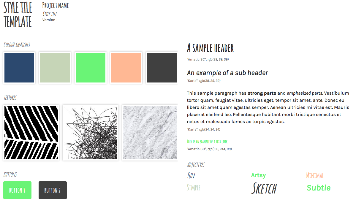
3. Create a style tile
Use the style guide template in the zip file to create your own style tile, instantiating the values that you selected above. Ideally, you will create at least two style tiles, but let’s start with one. Based on the 3 final values you have chosen to convey from step 1, play around with colors, textures, fonts, etc. in the style.css file.
