Assignments > Homework 1. CSS Layouts
Due on Wed, 04/21 @ 11:59PM. 10 Points.
For your first homework assigment, you will be doing two code walkthroughs, designed to help you to practice using CSS Grid and Flexbox to create layouts:
You are totally welcome to use your own techniques in lieu of the ones shown in the tutorial videos. That said, the result should look the same.
Part 1: CSS Grid exercise
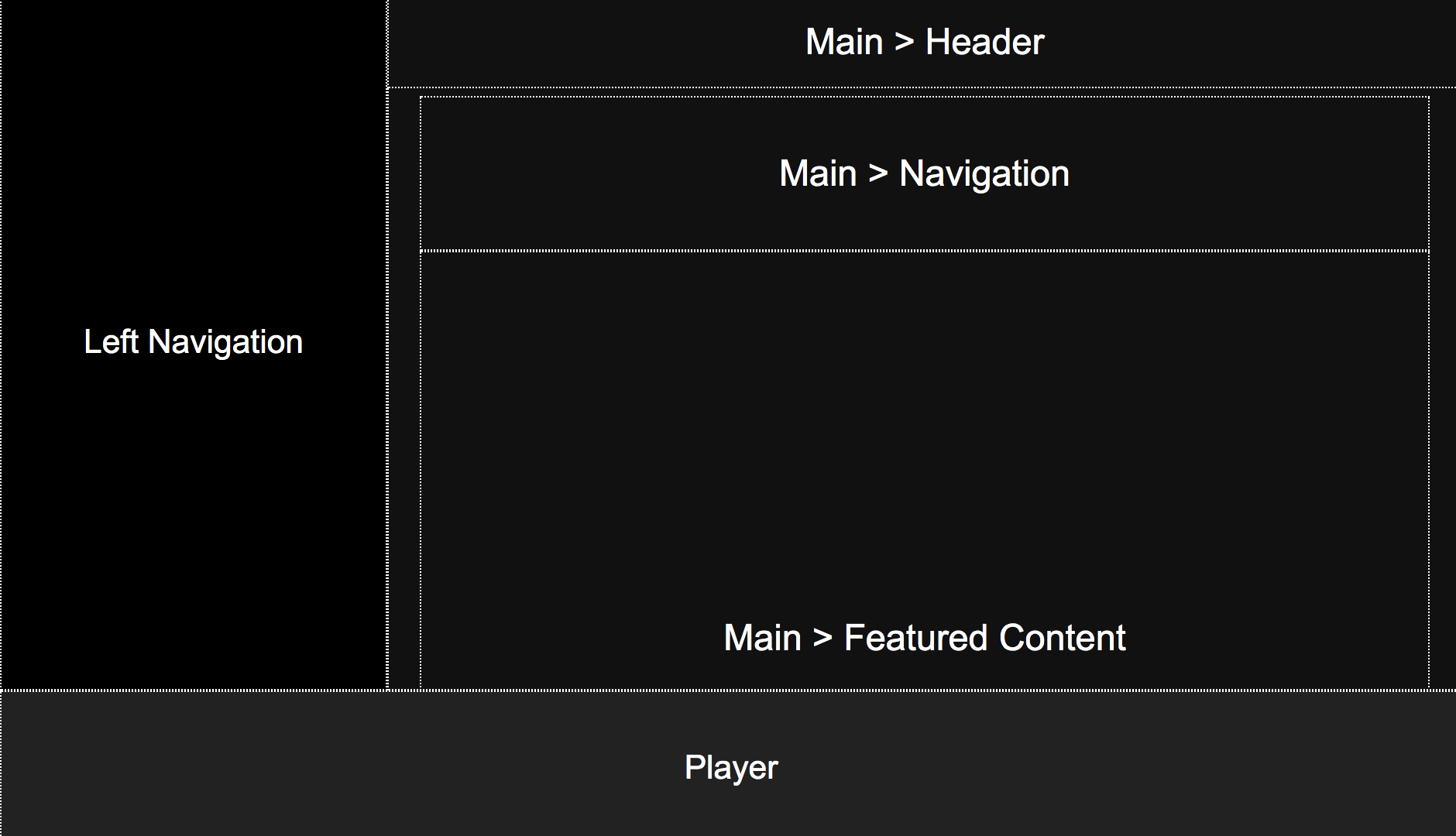
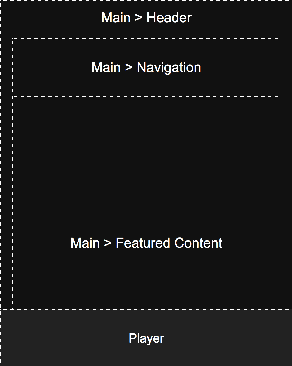
CSS Grid is a set of rules designed to create page layouts in terms of a series of columns and rows. In Part 1, you will use CSS grid to produce the layouts pictured below (for desktop and mobile) by following along with this tutorial video . Specifically, you will:
- Open the
01_cssgridout/index.htmland01_cssgrid/layout.cssfiles, and - Edit them while following along with the tutorial video (below).
Notes
As you complete the tutorial, note that the desktop layout is controlled by the CSS grid code shown below, which is applied to the “body” selector (i.e. the selector applied to the body tag). Each region of the page is then assigned to an area using the grid-area property. Note, there are other ways to accomplish this same effect. This is one approach.
body {
    display: grid;
    overflow: hidden;
    margin: 0px;
    grid-template-columns: 250px auto;
    grid-template-rows: auto 100px;
    grid-template-areas:
       "left main"
       "bottom bottom";
    height: 100vh;
}
The mobile layout is achieved by overriding the body selector with new CSS grid rules within a media query. In this case, the grid is redefined as a single-column layout, the left panel gets hidden, and the position of the header is reconfigured:
@media screen and (max-width: 700px) {
    body {
        grid-template-columns: auto; // now just one column
        grid-template-areas:
           "main"
           "bottom";
        height: 100vh;
    }
    header {
        left: 0px;
        width: 100vw;
    }
    aside {
        display: none; // panel is hidden
    }
}
Part 2: Flexbox exercise + image formatting tips (required)
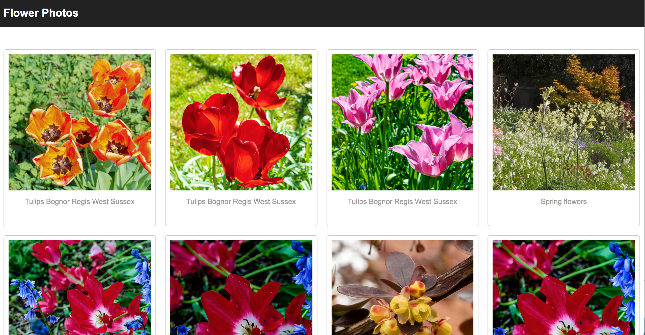
In Part 2, you will create a responsive (i.e. mobile-friendly) image gallery, pictured below, using “flexbox.” Flexbox provides a way to arrange the child elements within a container, and is typically used in two ways:
- To align content (horizontally and vertically), and
- To control how content wraps and stretches along a given axis.
Desktop Layout
Tablet & Mobile Layouts
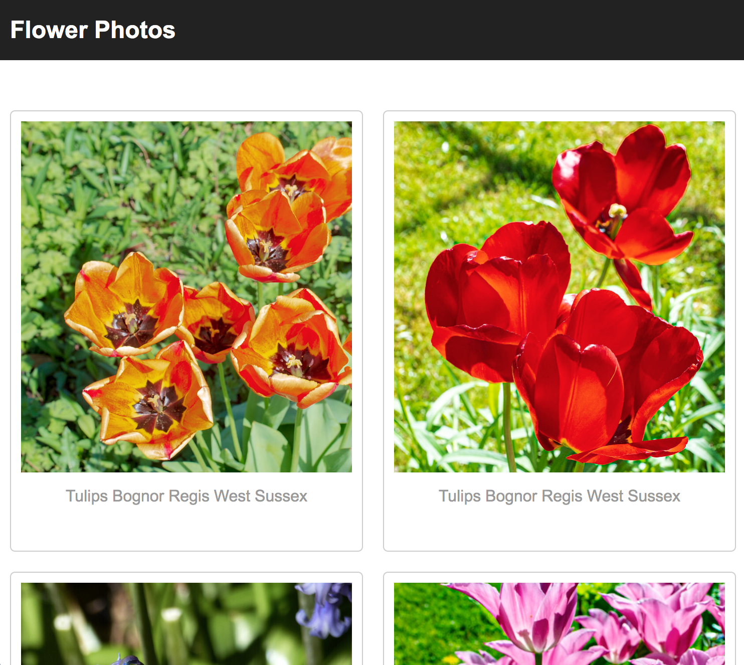
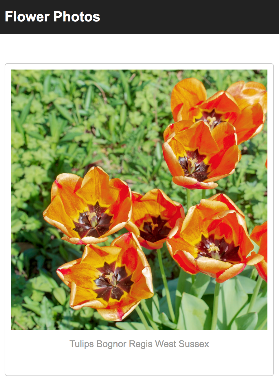
I have created another tutorial video to help you apply flexbox to the starter files. Your job is to follow along with the video to implement the responsive image gallery pictured below:
1. Create cards
- Use the flexbox properties to create cards that flow as horizontal rows, as described in the video, from
1:00-5:40 - Make your images uniform by following the steps described in the video, from
5:40-10:50. This includes:- Replace all of the image tags with div tags that have an image background. To make your life easier, just replace all of the
<section class="card">...</section>tags with the ones found inhints/hint_1.html - Add a
.image-divstyle block in yourgallery.cssfile to style your newly pasted “div images” - Apply the margin, padding, and alignment suggestions to improve the composition of the gallery.
- Replace all of the image tags with div tags that have an image background. To make your life easier, just replace all of the
2. Add borders / accents by adding another div
A common design technique involves adding borders to your cards and spacing them x-units apart. However, margin isn’t taken into account when your browser calculates widths. Therefore, if you set each card’s width to 20% (so that you have 5 cards per row) but then you give each card a margin, this added margin will push your fifth card onto the next row. Because of this, if you want to add a border, you’ll have to create a child element inside the card and give the child element a border, as shown in the video, from 10:50-16:20. Please do the following:
- Create a div directly inside of each card to enclose your .image-div and .caption tags. An example of this can be found in
hints/hint_3.html. - Style your newly added div images a border.
3. Make your interface responsive
Make your interface responsive by applying media queries, as shown in the video, from 17:35-20:45.
This requires (a) adding a “viewport” metatag to your index.html file (as pictured below):
<meta name="viewport" content="width=device-width, initial-scale=1.0">
<head>
    <meta charset="utf-8">
    <title>Image Gallery</title>
    <link rel="stylesheet" href="hint_4.css">
    <meta name="viewport" content="width=device-width, initial-scale=1.0">
</head>
And some CSS…
@media screen and (max-width: 1000px) {
    .card {
        width: 50%;
    }
    .card .image-div {
        height: 350px;
    }
}
4. Hover effects
Finally, add the hover effects described in the video, from 20:45-end.
What to turn in
When you’re done, paste the following links into the submission text box on Canvas:
- A link to hw01 (from GitHub pages). When we click this link, it should open a website showing your implementation of hw01.
- A link to your hw01 files (on your GitHub repository).
Rubric
Part 1: CSS Grid exercise (5 Points)
- Desktop layout implemented as pictured (2.5 pts)
- Mobile layout implemented as pictured (2.5 pts)
Part 2: Photo Gallery (5 Points)
- Desktop View (screen width greater than 1200) (2 pts)
- Photos are all the same size.
- There are
FOURphotos per row.
- There is a border around each card (0.5 pts)
- Mobile View (2 pts)
- When the screen is between 1200 and 900 pixels, there are only
THREEphotos per row. - When the screen is between 900 and 700 pixels, there are only
TWOphotos per row. - When the screen is less than 700 pixels, there is only
ONEphotos per row.
- When the screen is between 1200 and 900 pixels, there are only
- Hover effects have been implemented. (0.5 pts)