Lessons > 5. Intro to Visual Design - Part I
Today we will be discussing some principles of good composition and visual design (which will continue into next week).
Review the Slides
Watch the Lecture Video(s)
- Visual Design Part 1 (lecture recording)
Review / Study the Supplemental Materials
- Williams, Robin (2015). The Non-Designer's Design Book, Chapter 1.
- Williams, Robin (2015). The Non-Designer's Design Book, Chapter 2.
Do the Activity: Implementing Good Composition using HTML/CSS
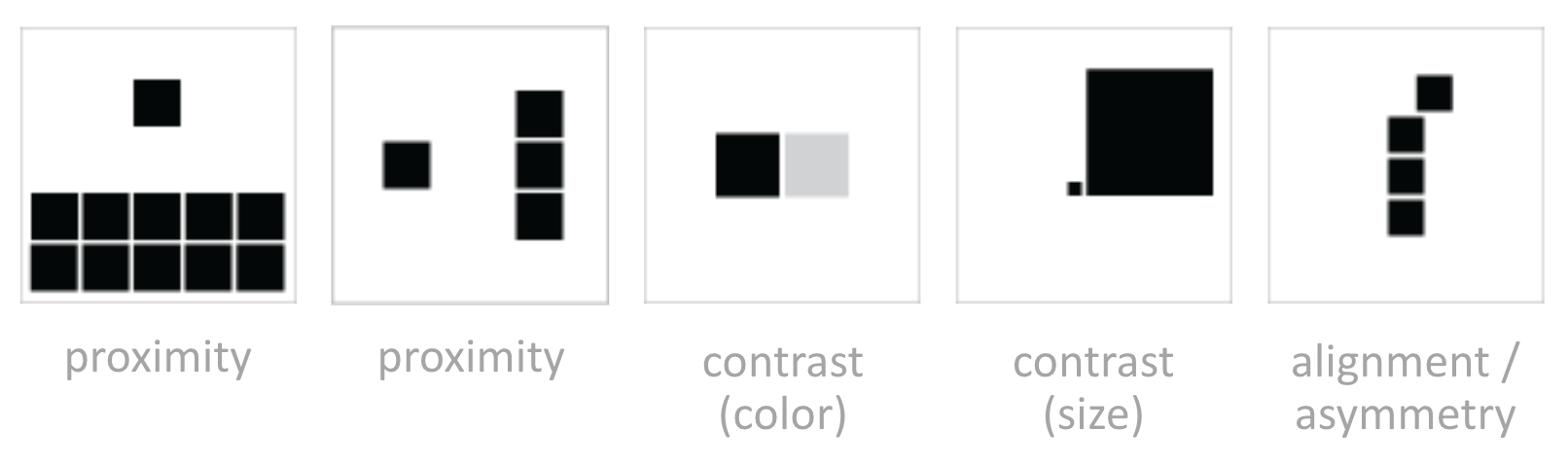
Practice using some of the CSS properties to to apply good composition principles (proximity, alignment, repetition, contrast) to the sample Codepen. These principles can be mixed and matched in many ways, and instantiated using size, color, margins, padding, fonts, and so forth. Please complete the following tasks:
- Select a header and a body copy font from Google Fonts, and apply these fonts to your page. Here is some sample code of how this is done.
- Instantiate the principles of proximity and alignment to organize your content. Make sure that you have an implicit grid and group like things together.
- Use the principle of contrast to make more important content stand out.
Tips
- Use whitespace liberally
- Play around with different font weights (and choose a font that supports many weights).
- Try not to use any borders. Let the whitespace shape the sections.
- For now, don’t use color. We’ll do that next week!
Review of some relevant CSS properties
Text Properties
Just a reminder of a few useful text properties for creating nice, readable web pages.
.body-copy
    font-family: "Times New Roman", Times, serif;
    font-style: italic;
    font-weight: bold;
    color: #999;            // font color
    text-align: left;       // left is default
    letter-spacing: 1.5em;  // space between letters
    line-height: 120%;      // space between lines
    word-spacing: 5px;      // Space between words (usually default is good)
    font-size: 1.1em;       // for responsive design, use em units
}
For custom fonts, use Google Fonts. Once you’ve selected one, scroll down to see suggested parings. See the CSS reference for more information on text & fonts.
CSS Units
See the CSS reference for more information on browser units.
The Box Model
A few quick code reminders…
.page-section {
    box-sizing: border-box;     // "border-box" does not count padding / border in size calculations
    border: dotted 1px #CCC;
    padding: 10px;              // note: also padding-right, padding-left, padding-top, padding-bottom
    margin: 10px;               // note: also margin-right, margin-left, margin-top, margin-bottom
    width: 50vh;                // vh stands for viewport height, vw stands for viewport width
}
See the CSS reference for more information on the box model.