Assignments > Homework 2. HTML & CSS Practice: Spotify
Due on Tue, 05/05 @ 11:59PM. 10 Points.
With respect to interface design, Layouts are, hands-down, one of the most difficult things to accomplish in CSS. As such, HW2 consists of three parts:
- A CSS Grid exercise (recommended)
- A Flexbox exercise (required)
- Implementing some of the Spotify interface (required)
Whereas the first two are tutorial-style exercises that walk you through the steps of creating particular effects, you will do the Spotify activity on your own (but of course come to office hours and ask lots of questions).
Part 1: CSS Grid exercise (recommended)
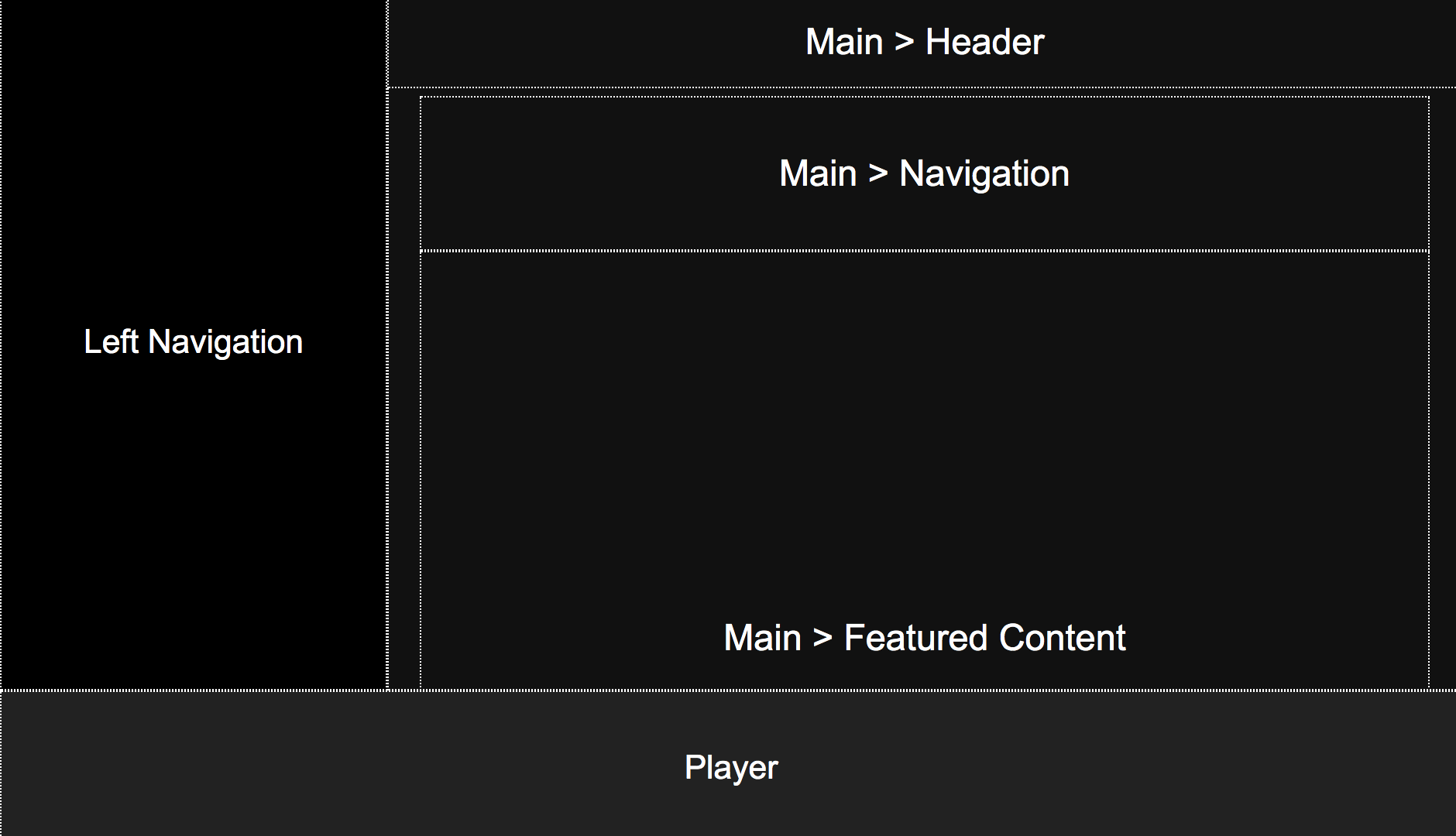
The purpose of CSS Grid is to provide a relatively straightforward way of laying out the high-level structure of your web page (columns and rows). In this example, I walk you through an example of using CSS grid to produce the high-level layouts pictured below (for desktop and mobile).

Practice
I’ve created a tutorial video that walks you through the process of creating a CSS Grid Layout. This is an OPTIONAL activity, but I encourage you to complete if if you have the time. Follow along by:
- Opening the
01_cssgridout/index.htmland01_cssgrid/layout.cssfiles, and - Editing them while following along with the tutorial video (below).
Notes
As you complete the tutorial, note that the desktop layout is controlled by the CSS grid defined in the “body” selector (i.e. the selector applied to the body tag). Each region of the page is then assigned to an area using the grid-area property. Note, there are other ways to accomplish this same effect. This is one approach.
body {
    display: grid;
    overflow: hidden;
    margin: 0px;
    grid-template-columns: 250px auto;
    grid-template-rows: auto 100px;
    grid-template-areas:
       "left main"
       "bottom bottom";
    height: 100vh;
}
The mobile layout is achieved by overriding some of the CSS properties within a media query. In this case, the grid is redefined as a single-column layout, the left panel gets hidden, and the position of the header is reconfigured:
@media screen and (max-width: 700px) {
    body {
        grid-template-columns: auto;
        grid-template-areas:
           "main"
           "bottom";
        height: 100vh;
    }
    header {
        left: 0px;
        width: 100vw;
    }
    aside {
        display: none;
    }
}
I have also provided you with some intermediate files in the 01_cssgrid/hints folder, which break down how this layout was created into steps.
Part 2: Flexbox exercise + image formatting tips (required)
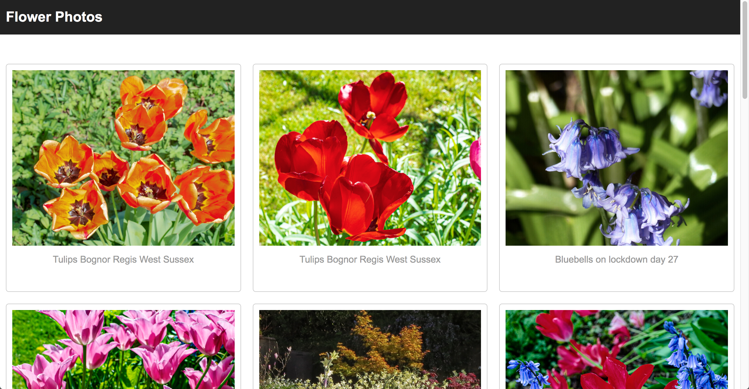
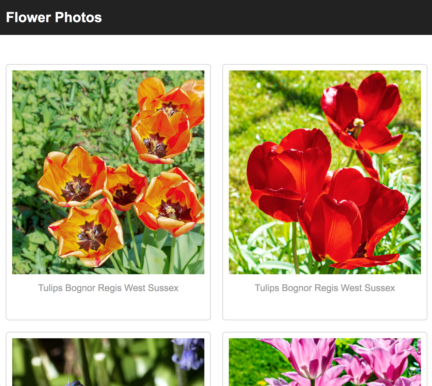
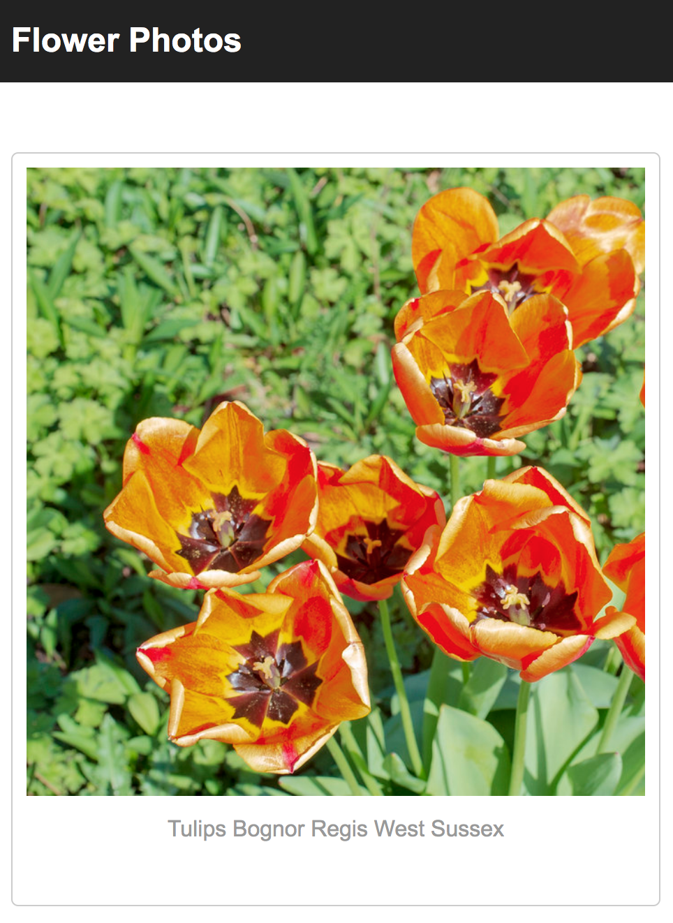
Part 2 is required, and walks you through a series of steps to create a responsive (i.e. mobile-friendly) image gallery. We will use “flexbox” to do this. Flexbox provides a way to control the child elements within a particular container, and is typically used in two ways: (a) to align content (horizontally and vertically), and (b) to control how content wraps and stretches along a given axis. I have created another tutorial video to help you apply flexbox to the starter files. Your job is to follow along with the video to implement the responsive image gallery pictured below:
Desktop Layout
Tablet & Mobile Layouts
A. Create cards
- Use the flexbox properties to create cards that flow as horizontal rows, as described in the video, from
1:00-5:40 - Make your images uniform by following the steps described in the video, from
5:40-10:50. This includes:- Replace all of the image tags with div tags that have an image background. To make your life easier, just replace all of the
<section class="card">...</section>tags with the ones found inhints/hint_1.html - Add a
.image-divstyle block in yourgallery.cssfile to style your newly pasted “div images” - Apply the margin, padding, and alignment suggestions to improve the composition of the gallery.
- Replace all of the image tags with div tags that have an image background. To make your life easier, just replace all of the
B. Add borders / accents by adding another div
A common design technique involves adding borders to your cards and spacing them x-units apart. However, margin isn’t taken into account when your browser calculates widths. Therefore, if you set each card’s width to 20% (so that you have 5 cards per row) but then you give each card a margin, this added margin will push your fifth card onto the next row. Because of this, if you want to add a border, you’ll have to create a child element inside the card and give the child element a border, as shown in the video, from 10:50-16:20. Please do the following:
- Create a div directly inside of each card to enclose your .image-div and .caption tags. An example of this can be found in
hints/hint_3.html. - Style your newly added div images a border.
C. Make your interface responsive
Make your interface responsive by applying media queries, as shown in the video, from 17:35-20:45.
This requires (a) adding a “viewport” metatag to your index.html file (as pictured below):
<meta name="viewport" content="width=device-width, initial-scale=1.0">
<head>
    <meta charset="utf-8">
    <title>Image Gallery</title>
    <link rel="stylesheet" href="hint_4.css">
    <meta name="viewport" content="width=device-width, initial-scale=1.0">
</head>
And some CSS…
@media screen and (max-width: 1000px) {
    .card {
        width: 50%;
    }
    .card .image-div {
        height: 350px;
    }
}
D. Hover effects
Finally, add the hover effects described in the video, from 20:45-end.
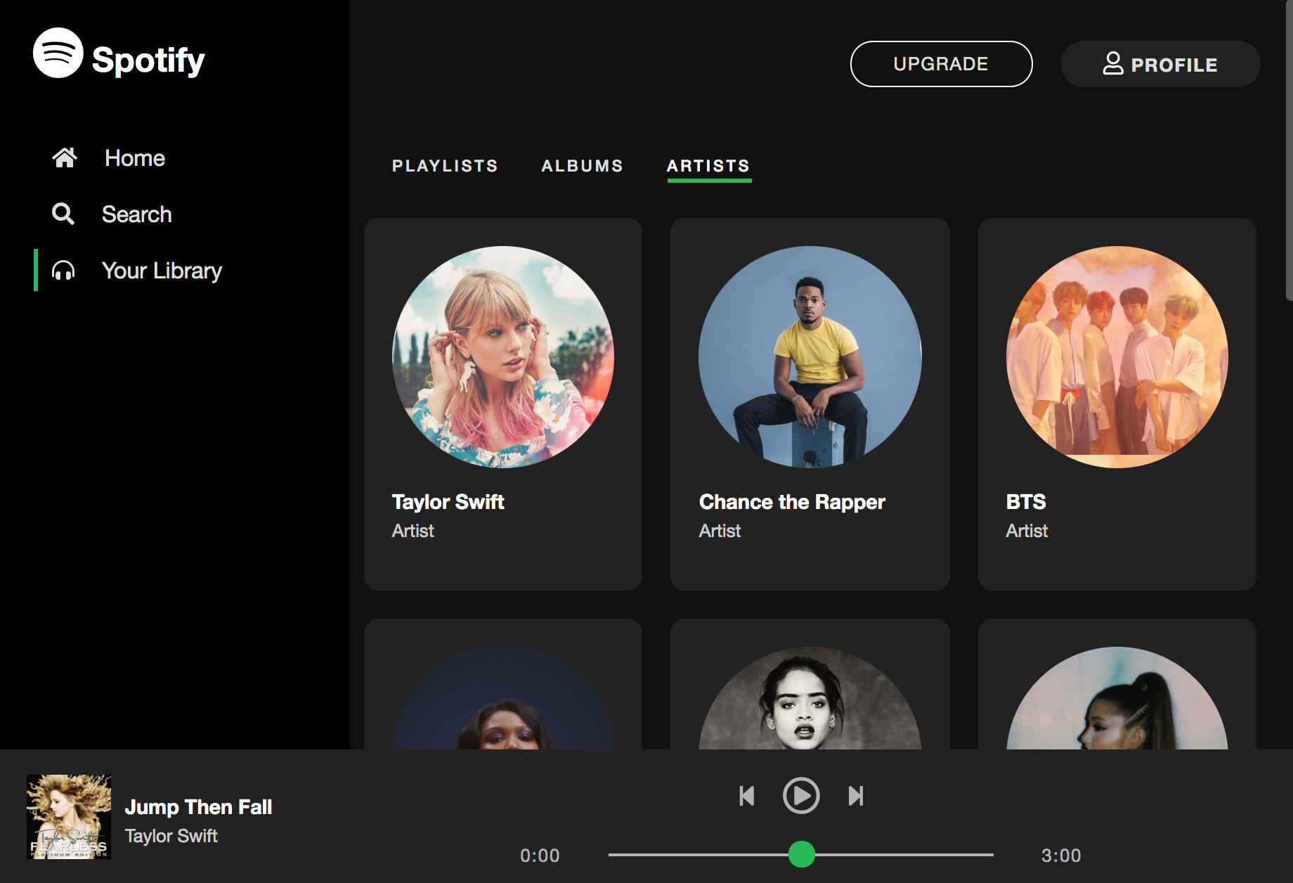
Part 3: Spotify CSS (required)
Now that you have some experience with CSS Grid and Flexbox, you are going to implement elements of the Spotify UI (as pictured below). This week, you will be implementing the look-and-feel of the website. In a future assigment, you will actually be programming the interactions / data queries using JavaScript in order to pull down actual songs, images, and text down from the Spotify servers (and play some music).
Please read the instructions carefully and complete the 5 steps below, using the starter files contained within the 03_spotify folder.
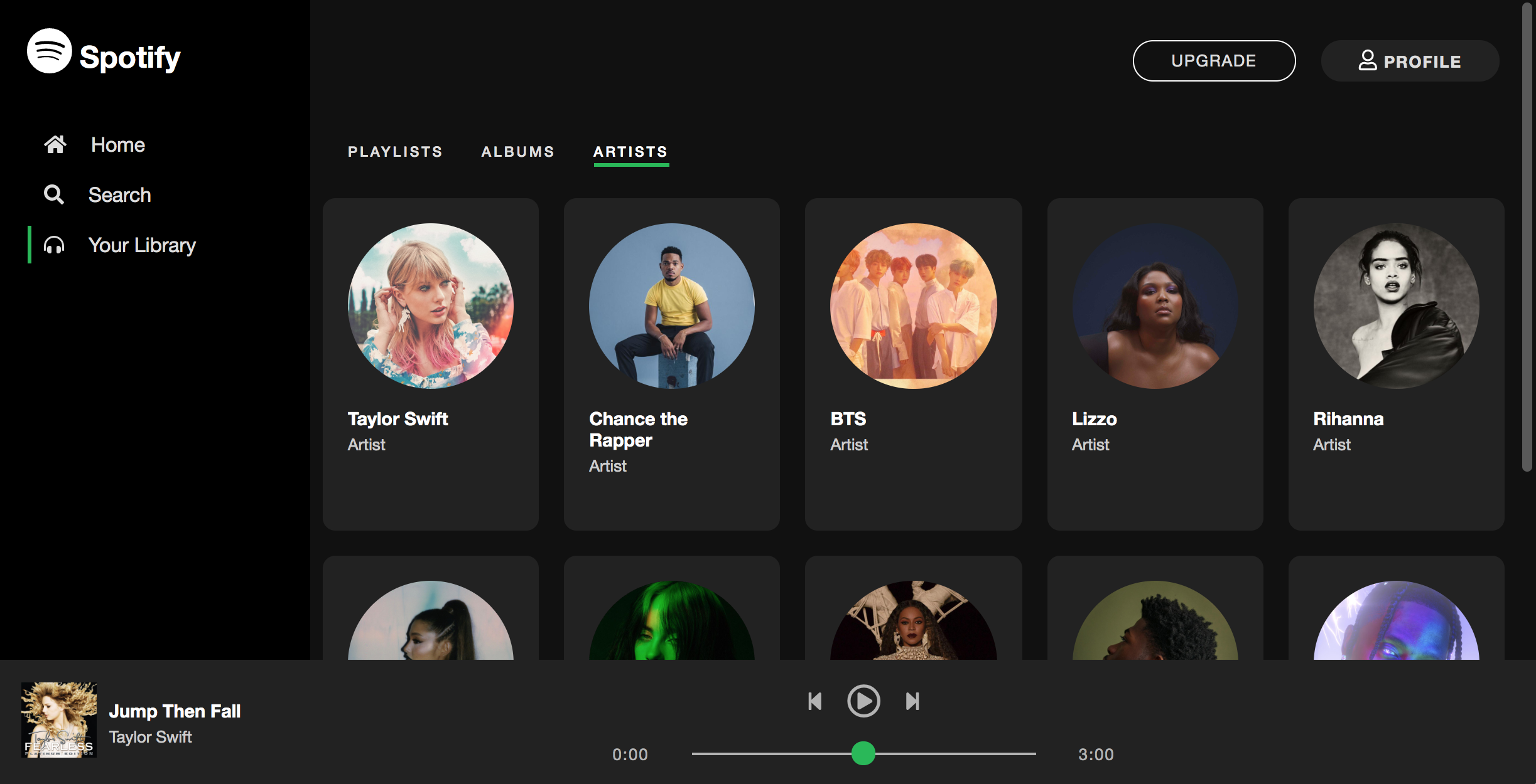
A. Left Navigation
Complete the following tasks:
In the index.html file, add Font Awesome icons (Spotify logo, home, search, and headphones) within the “aside” tag (pictured below) in accordance with the screenshot. Note that the Font Awesome font reference is already included at the bottom of your index.html file. Your job is to search for relevant icons and include them. For instance, to get the Spotify icon, take a look here.
Other than adding the icons, please do not make any other changes to the HTML.
<aside id="sidebar">
    <h1>
        <!--TODO: Font Awesome Icon Here -->
        Spotify
    </h1>
    <a href="#">
        <!--TODO: Font Awesome Icon Here -->
        Home
    </a>
    <a href="#">
        <!--TODO: Font Awesome Icon Here -->
        Search
    </a>
    <a class="selected" href="#">
        <!--TODO: Font Awesome Icon Here -->
        Your Library
    </a>
</aside>
In the style.css file, update the CSS to make the UI look like the screenshots (pictured above). This should be accomplished primarily by using flexbox properties and the box model. Be sure to put all of the CSS related to the left navigation in style.css.
B. Header & Nav Styling
Next, you need to style the header and nav sections:
<header>
    <a href="#" id="upgrade">Upgrade</a>
    <a href="#" id="profile">
        <i class="far fa-user"></i> Profile</a>
</header>
<nav>
    <a href="#">Playlists</a>
    <a href="#">Albums</a>
    <a class="selected" href="#">Artists</a>
</nav>
In the style.css file, add CSS style blocks to make the UI look like the screenshots (pictured above). Just as with Step #1, all alignment should be done using the box model (e.g. padding, margin, height, width) and with flexbox (e.g. flex-direction, justify-content, align-items).
C. Artists Panel
Next, you need to style the section cards that represent each Spotify artist (pictured below):
<article id="featured-content">
    <section class="artist-card">
        <div>
            <img src="https://i.scdn.co/image/62b33d12e2b9a033cf77585f6e3d4b2c6b3a63a1" />
            <h3>Taylor Swift</h3>
            <p>Artist</p>
            <span class="play-button"><i class="fas fa-play"></i></span>
        </div>
    </section>
    ...
</article>
In the style.css file, add CSS style blocks to make the UI look like the screenshots (pictured above). Again, all alignment should be done using the box model (e.g. padding, margin, height, width) and with flexbox (e.g. flex-direction, justify-content, align-items).
D. Create Responsive UIs
Create the following responsive UIs shown below. If you’re using more than 10-15 lines of code to achieve each of these effects, you’re on the wrong track. Add the CSS to make these responsive UIs to style.css.
Tablet: Use Flexbox to display albums 3-across.
Mobile: Use Flexbox to display albums 2-across and hide the left menu.
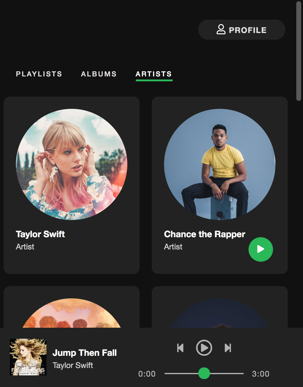
E. Hover Effects
Finally, implement the 4 hover effects shown in this video.
Rubric
Part 2 (3 Points)
- Desktop View (screen width greater than 1200) (1 pt)
- Photos are all the same size
- There are
FIVEphotos per row
- There is a border around each card (1/2 pt)
- Mobile View (1 pt)
- When the screen is between 1200 and 700 pixels, there are only
THREEphotos per row - When the screen is less than 700 pixels, there are only
TWOphotos per row
- When the screen is between 1200 and 700 pixels, there are only
- Hover effects have been implemented (1/2 pt)
Part 3 (7 Points)
- Left Navigation (2 pt)
- Icons added
- Styling reflects screenshot
- Header & Nav Styling (1 pt)
- Artists Panel (2 pts)
- Responsive UIs Implemented (1 pt)
- Hover effects implemented (1 pt)
What to turn in
To submit this week’s homework assignment, copy your completed hw02 folder into your repo folder. Then add, commit, and push all of your files to GitHub. Your commands should look something like this:
$ git add hw02
$ git commit -am "Checking in my hw02 folder"
$ git push
When you’re done, paste a link to your hw02 GitHub pages on Canvas under the Homework 2 assignment.